Data Presentation Guide 2025: Master Visuals, Storytelling & Tools

Raw data is just numbers, Refining it tells the real story. The key difference? Data presentation.
Is data presentation a skill?
In a world overflowing with numbers, the real skill isn’t just data and graphs, it’s how you communicate it. If your charts confuse, your tables bore, or your insights get lost, your message loses impact, no matter how accurate the numbers are.
This guide will help you master data presentation. You’ll learn proven methods to structure your message, pick the right visual, and speak directly to your audience, whether they’re technical or non-technical. From foundational principles to avoiding common pitfalls, we’ll walk through what makes data truly understandable and actionable.
What is data presentation?
Data presentation is the process of organising, visualising, and communicating data in a way that makes it easy to understand, interpret, and act upon. It transforms raw numbers and statistical data into structured formats that reveal patterns, trends, and insights. Effective data storytelling is not just about making visuals look appealing; it’s about clarity, accuracy, and relevance to the audience’s needs.
Whether you’re summarizing survey results, tracking performance metrics, or forecasting business growth, the goal of data presentation is to reduce complexity without sacrificing meaning. It bridges the gap between analysis and decision-making, ensuring that stakeholders at all levels can grasp key takeaways quickly. Done well, it turns complex data from a passive collection of facts into a powerful driver of informed action.
Why data presentations are important
A strong presentation ensures that key messages are understood quickly and correctly across teams.
Enables faster, evidence-based decision-making
Bridges communication gaps between technical and non-technical stakeholders
Enhances credibility and trust in data-driven insights
Improves alignment on goals and performance
Reduces risk of misinterpretation or oversight
When data is presented clearly, it becomes a shared language for action. It empowers teams to move forward confidently, knowing they’re guided by reliable, well-communicated insights.
What are the three main forms of data presentation?
The three data presentation format serve different purposes and are most effective when used appropriately based on context, audience, and data complexity. Understanding these core methods ensures clarity and impact in communication.
Textual presentation
This method involves describing data using written narrative. It’s best for highlighting key insights, providing context, or explaining trends in a conversational or report format. While easy to produce, it lacks visual immediacy and can become overwhelming with large datasets. Use it to summarize findings or support visuals with explanations.
Use Case: Summarizing quarterly performance in an executive report.
Data presentation example:
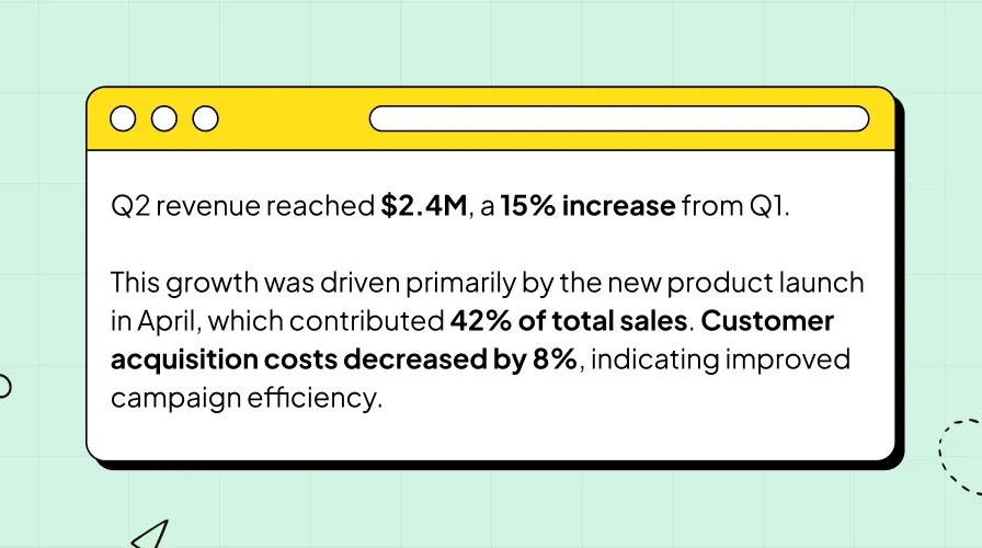
It conveying narrative insights where precision isn’t required, but context and interpretation are key. It works well in emails, summaries, or slide notes.
Tabular presentation
Data is organized into rows and columns, making it ideal for precise values, comparisons, and structured overviews. Tables maintain data integrity and allow for detailed data analysis, but require careful formatting to avoid clutter. They work well when exact numbers matter, such as financial reports or performance metrics across time periods.
Use Case: Comparing data on monthly basis for marketing performance across channels.
Data presentation example:
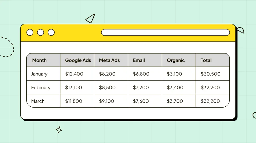
Tables are powerful when exact figures matter. They allow side-by-side comparison and support auditability. However, they should be kept clean, avoid excessive rows, use clear headers, and highlight key cells (e.g., growth percentages) to guide attention.
Graphical presentation
It's most powerful methods for making data instantly understandable. It transforms complex datasets into visual formats that highlight patterns, trends, and outliers at a glance. Unlike tables or text, visuals engage the brain’s natural ability to process images quickly, making them ideal for storytelling, presentations, and dashboards.
Common chart types and their use cases
Bar Chart
Best for comparing values across categories. Vertical bars work well for time-based comparisons (e.g., monthly sales), while horizontal bars are ideal for categories with long names (e.g., product names). Use when you have fewer than 10 groups to avoid clutter.
Use Case: Comparing Q1 revenue across five regional teams.
Line Chart
Shows trends over time by connecting data points with lines. Multiple lines can compare different series (e.g., actual vs. forecast). Emphasizes continuity and change.
Use Case: Tracking website traffic growth over 12 months.
Pie Chart
Displays proportions of a whole. Each slice represents a category’s percentage. Best for simple compositions with 2–5 segments. Avoid when slices are too similar or too numerous.
Use Case: Showing marketing budget allocation across channels.
Scatter Plot
Reveals relationships between two variables. Each dot is a data point; clustering or direction suggests correlation. Adding trendlines enhances interpretation.
Use Case: Analyzing ad spend vs. conversion volume across campaigns.
Histogram
Shows frequency distribution of a single variable using bins (ranges). Bars touch each other to emphasize continuity. Helps identify data spread and outliers.
Use Case: Understanding customer age distribution for a product launch.
Area Chart
A filled line chart that emphasizes volume or cumulative totals. Stacked versions show how components contribute to the whole over time.
Use Case: Visualizing monthly revenue contributions from three product lines.
Graphical representation is not just about choosing any chart, it’s about selecting the right one for your message. A well-designed visual simplifies complexity, reveals insights, and drives action. When combined with clear labeling, appropriate scales, and minimal clutter, it becomes an indispensable tool in any data presentation.
Choosing the right method depends on your goal: use text for context, tables for detail, and visuals for impact. Often, the most effective presentations combine all three to deliver a complete, compelling message.
What to include in a data presentation
A successful data presentation balances completeness with clarity. It should guide the audience from context to insight without overwhelming them. The goal is to include only what’s necessary to support understanding and drive decisions.
Clear title and objective
Start with a concise title that reflects the core message, such as “Q3 Growth Driven by New Market Expansion.” Pair it with a one-sentence objective that answers: What should the audience learn or do? This sets the tone and manages expectations from the start.
Context and background
Explain why the data matters. Include brief background, such as business goals, challenges, or timelines to frame the analysis. For example, “After a 15% drop in engagement, we launched a retention campaign in June.” This helps non-technical stakeholders follow the story.
Key metrics and KPIs
Focus on the most relevant metrics that align with your objective. Avoid data dumping. If you’re presenting campaign performance, highlight CTR, conversion rate, and ROI—not every secondary metric tracked. Use bold or color to draw attention to critical numbers.
Visuals that support the narrative
Include charts or graphs that directly illustrate your key points. Each visual should answer a specific question. Use bar charts for comparisons, line charts for trends, and pie charts for composition. Ensure all visuals are labeled clearly with titles, axis labels, and legends.
Annotations and highlights
Use callouts, arrows, or shaded areas to emphasize important insights. For instance, annotate a spike in a line chart with “Product launch + influencer campaign.” This guides the audience’s attention and reduces misinterpretation.
Summary and recommendation
End with a concise takeaway. What does the data mean, and what should be done next? Instead of saying “Sales increased,” say “Sales increased by 30%, suggesting we should allocate more budget to this channel.” This transforms insight into action.
Include only what adds value. A focused, well-structured presentation builds credibility, ensures clarity, and drives faster decisions.
Do’s and Don’ts in data presentation
Creating an effective data presentation requires more than just accurate numbers, it demands thoughtful design and clear communication. Follow these best practices to ensure your message is understood, trusted, and acted upon.
✅ Do’s
Do start with a clear objective
Begin with a focused message. Define what you want your audience to know or do. This keeps your presentation aligned and prevents data overload.
Do know your audience
Tailor complexity and language. Executives need high-level insights; analysts may want methodological detail. Adjust visuals and depth accordingly.
Do use visuals strategically
Choose the right chart type for your data. Use bar charts for comparisons, line charts for trends, and dashboards for real-time monitoring. Each visual should answer one key question.
Do label everything clearly
Include titles, axis labels, units, and legends. Avoid jargon. A well-labeled chart stands on its own, even without explanation.
Do highlight key insights
Use color, annotations, or callouts to draw attention to important data points. For example, “+22% growth post-campaign” immediately signals value.
Do keep it simple
Focus on the most relevant metrics. Remove anything that doesn’t support your core message. Clarity beats comprehensiveness.
❌ Don’ts
Don’t overload with data
Avoid cluttered charts, excessive tables, or too many metrics. This overwhelms the audience and dilutes your message. If it’s not essential, leave it out.
Don’t use 3D or decorative effects
3D pie charts, shadows, or unnecessary animations distort perception and reduce readability. Stick to clean, flat designs.
Don’t mislead with scales
Never manipulate Y-axis ranges to exaggerate differences. Start from zero when appropriate, and be transparent about scale choices.
Don’t ignore context
Never present raw numbers without background. Explain why the data matters, what changed, and what actions were taken.
Don’t use jargon without explanation
Terms like “CTR,” “ROAS,” or “standard deviation” may confuse non-technical audiences. Define them briefly or use simpler alternatives.
Don’t forget the story
A list of charts isn’t a presentation. Connect the dots with a narrative: what was the challenge, what did the data reveal, and what should be done next?
Following these do’s and don’ts ensures your data presentation is professional, credible, and impactful—turning insights into informed decisions.
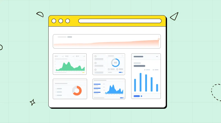
Modern data presentation tools
Today’s data professionals need tools that go beyond basic charts and spreadsheets. The best platforms streamline data collection, visualization, and storytelling—helping you move from raw numbers to compelling insights faster. Here’s a look at the types of tools shaping proper data presentation.
Data Visualization Tools
These are dedicated platforms for creating charts, dashboards, and interactive reports.
Tableau and Power BI offer powerful drag-and-drop interfaces for building dynamic, real-time dashboards. Ideal for analysts who need deep customization and enterprise-level sharing.
Google Data Studio (now Looker Studio) is free and integrates seamlessly with Google Marketing Platform, making it popular for marketers and small teams.
Chart.js and D3.js are open-source libraries for developers who want to embed custom visuals into web apps.
Spreadsheet and Presentation Software
Still widely used for their accessibility and familiarity.
Microsoft Excel and Google Sheets support basic charts and pivot tables. Great for quick analysis, but can become unwieldy with multiple datasets.
Microsoft PowerPoint and Google Slides are go-to tools for final delivery, especially when combining visuals with narrative text and annotations.
Integrated Analytics Platforms
These tools combine data connections, transformation, and visualization in one place.
ReportDash connects over 50 marketing and sales sources—like Google Ads, HubSpot, TikTok Ads, and Shopify—directly to Looker Studio. It eliminates manual data pulling and ensures consistency across reports.
Mixpanel and Amplitude focus on product analytics, offering built-in dashboards for user behavior and engagement.
Funnel.io and Supermetrics act as data pipelines, pulling metrics from ad and CRM platforms into visualization tools.
AI-Powered Presentation Tools
Emerging tools use AI to automate insight generation and slide creation.
Prezent and Beautiful.ai help create on-brand, professional presentations with smart templates and real-time collaboration.
Zoho Analytics and ThoughtSpot use natural language processing to let users ask questions and generate visuals instantly.
Collaboration and Sharing Tools
Effective data presentation isn’t just about creating visuals—it’s about sharing them.
Notion and Confluence allow teams to embed live dashboards into documentation.
Slack integrations let you push key metrics directly to channels for real-time updates.
The right tool depends on your workflow, data sources, and audience. The key is choosing solutions that reduce manual work, ensure data accuracy, and support storytelling—so you can focus on insight, not formatting.
Key Takeaways
Effective data presentation is essential for turning raw information into actionable insights. It’s not just about showing numbers, it’s about clarity, context, and communication. Whether you're a data analyst, marketer, or business leader, how you present data determines whether it drives decisions or gets ignored.
Use the right method: Combine textual, tabular, and graphical formats based on your goal text for context, tables for detail, and visuals for impact.
Choose the correct chart type: Bar charts for comparisons, line charts for trends, pie charts for composition, and dashboards for real-time monitoring. Avoid misleading visuals like 3D effects.
Tell a story: Structure your presentation with a clear objective, context, insight, and recommendation. Answer the “So what?” to make your data meaningful.
Know your audience: Tailor depth and language executives need summaries, analysts may want methodology.
Keep it simple and honest: Highlight key metrics, avoid clutter, and never manipulate scales. Clarity builds trust.
Leverage modern tools: Platforms like Looker Studio, Power BI, and ReportDash streamline data integration and visualization, reducing manual work and improving accuracy.
Great data presentation is strategic, not just technical. By focusing on purpose, audience, and simplicity, you ensure your insights are understood, valued, and acted upon.
Frequently Asked Questions (FAQ) – Data Presentation
What are the 5 methods of data presentation with examples?
The five common methods include:
Textual – Describing data in narrative form (e.g., “Sales increased by 15% last quarter”).
Tabular – Organizing data in rows and columns (e.g., a table showing monthly revenue by region).
Bar Chart – Comparing categories (e.g., Q1 sales across five teams).
Line Chart – Showing trends over time (e.g., website traffic growth over 12 months).
Pie Chart – Displaying proportions (e.g., marketing budget allocation by channel).
How to make a data presentation in research?
Start with a clear objective and structure your research data logically. Begin with background, followed by methodology, key findings (using tables and charts), and conclusion. Use consistent formatting, label all visuals, and avoid clutter. Focus on telling a coherent story that supports your hypothesis.
What is the most effective way to present data?
The most effective way is data storytelling, combining visuals, context, and narrative. Use the right chart type for your message, keep it simple, highlight key insights, and end with a clear recommendation. This approach ensures understanding and drives action.
What is the best way to present a lot of data?
Use dashboards to consolidate high-volume data. Break information into sections, use filters, and include summary visuals (e.g., KPI cards). Prioritize the most important metrics and use interactivity (e.g., drill-downs) to manage complexity without overwhelming the audience.
What are the 7 steps of data visualization?
Define your objective
Know your audience
Collect and clean data
Choose the right chart type
Design for clarity (labels, colors, layout)
Highlight key insights
Review for accuracy and simplicity
What are the different ways of presenting data?
Data can be presented through text, tables, bar/line/pie charts, scatter plots, histograms, infographics, dashboards, and narrative reports. The best method depends on data type, audience, and purpose.
What are the 5 types of data representation with examples?
Bar Graph – Sales by region
Line Graph – Monthly user growth
Pie Chart – Market share distribution
Table – Customer demographics
Dashboard – Real-time marketing performance
What are the four types of presentations?
In data communication, the four types are:
Informative – Sharing facts and metrics
Persuasive – Driving decisions with data
Instructional – Teaching how to interpret data
Reporting – Presenting periodic performance (e.g., monthly reviews)