The Best AI Data Visualization Tools to Enhance Your Analytics in 2025

Marketers have more data than ever, but making sense of it is harder than it should be. With 81% of organizations are now piloting or scaling AI teams under pressure to turn raw data into actionable insights. Yet, most marketing professionals face common frustrations with AI data visualization tools:
Too complex to set up and use
Hard to connect all your data sources (like Google Ads, Meta, Shopify)
Unpredictable costs and unclear pricing
Slow or unhelpful customer support
The result? Marketers spend more time wrestling with dashboards than actually creating visualizations or uncovering insights.
In this guide, we’ll break down the top AI data visualization tools for 2025. For each tool, you’ll see:
Who it’s ideal for
Pros and cons
Pricing and support details
How it stacks up in popularity and community size
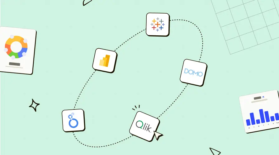
Which Are the Top Tools?
Below is a bar graph comparing the 5 leading AI data visualization tools by their web popularity and community followers:
What is AI-Powered Data Visualization?
AI-powered data visualization helps marketers and business teams turn raw data into actionable insights. Unlike traditional dashboards that require manual setup and technical expertise, these tools use artificial intelligence to automate data discovery, generate visualizations, and surface trends, often through natural language queries and smart recommendations.
Key features of AI data visualization tools:
Natural language processing: Ask questions in plain English, get instant charts and answers.
Auto-generated visualizations: Let the tool choose the best visual format for your data.
Predictive analytics: Spot trends, forecast results, and identify patterns before they impact your campaigns.
Anomaly detection: Instantly flag outliers or unexpected changes in your marketing data.
AI-powered dashboards enable users to uncover insights and create visualizations without requiring technical expertise or complex setup.
Why does this matter for marketers?
Faster data analysis: No more waiting for IT or data teams to build reports.
Smarter decision-making: Surface actionable insights from large, complex data sets in seconds.
Democratized access: Enable every team member from analysts to executives to explore data and generate interactive visualizations.
With AI data visualization tools, marketing teams can move from static dashboards to dynamic, interactive data stories making data-driven decisions faster and with more confidence.
Which AI Data Visualization Tool Is Right for You?
Choosing the best AI data visualization tool isn’t just about features—it’s about fit. Each platform excels for different business sizes, data environments, and marketing goals. Use this quick selector to match your needs with the right solution, ensuring you get actionable insights without unnecessary complexity or cost.
Business Need | Best Tool | Why It Stands Out |
|---|---|---|
Enterprise-scale analytics & AI | Power BI | Advanced analytics features, deep Microsoft integration, and robust community support. |
Visual storytelling & Salesforce synergy | Tableau + Einstein | Visual-first, rich AI features, seamless Salesforce integration, handles massive datasets. |
Executive-friendly, real-time dashboards | Domo | Real-time data storytelling, strong alerts, and broad data source connectivity. |
Google Cloud ecosystem, governed analytics | Looker | Scales from gigabytes to petabytes, deep Google Cloud/BigQuery integration, embedded analytics. |
Self-service analytics, flexible deployment | Qlik Sense | Associative engine, intuitive interface, and strong data integration for mid-size to enterprise. |
Here Are the Top 5 AI Data Visualization Tools for Marketers
Below, you’ll find a clear, side-by-side breakdown of the five most popular tools for 2025, focused on what matters to marketers: who each tool is ideal for, pros and cons, pricing, and support.
Microsoft Power BI
Microsoft Power BI offers robust artificial intelligence capabilities, seamless integration with the Microsoft ecosystem, and broad data source connectivity. These features make it a go-to solution for organizations seeking clarity from complex data.
Notable AI Features
Smart Narratives: Automatically generates textual summaries and explanations for your charts and dashboards, helping users understand trends without technical expertise.
NLP Q&A: Enables users to ask questions in natural language and receive instant, interactive data visualizations and answers.
Auto ML: Allows users to build and deploy machine learning models directly within the platform for predictive analytics and trend forecasting.
Anomaly Detection: Highlights outliers and unexpected patterns in your data, making it easier to spot issues or opportunities early.
Ideal For
Best for enterprises and mid-sized companies that need scalable, advanced analytics features and deep integration with Microsoft tools.
Data Sources: Connects with over 100 data sources, including Google Ads, Meta Ads, HubSpot, Salesforce, Shopify, SQL databases, and Excel.
Data Size: Handles everything from small marketing datasets to petabyte-scale enterprise data via import and DirectQuery modes.
Pros
Powerful AI features for automating data discovery and analysis
Deep integration with Microsoft 365, Azure, and Power Platform
Affordable entry-level pricing
Massive community support and frequent updates
Cons
Steep learning curve for advanced analytics and complex data models
Free version has limited sharing and collaboration
Performance can lag with extremely large or highly complex datasets
Pricing
Starts at $10 per user/month (Pro); Premium and enterprise options available
Community Support
Official Community: Power BI Community Portal
Reddit: r/PowerBI
Tableau + Einstein AI
Tableau, now powered by Einstein AI, is a top-tier AI data visualization tool built for teams that demand powerful analytics, interactive data visualizations, and actionable insights at large scale. Its visual-first approach and advanced artificial intelligence which makes it a favorite among organizations looking to move beyond static dashboards, into dynamic AI-powered data storytelling.
Notable AI Features
Tableau Pulse: Delivers personalized AI-driven insights and trend detection in natural language.
Tableau Agent: Conversational AI assistant for building calculations and generating interactive data visualizations.
Explain Data: Instantly reveals the drivers behind data changes, making complex data easier to understand.
Smart Clustering & Predictive Analytics: Detects patterns, segments audiences, and forecasts future trends automatically.
Automated Data Prep: AI streamlines data cleaning and preparation for faster analysis.
Ideal For:
Large enterprises and mid-sized companies that need advanced analytics, robust governance, and scalable deployment.
Data Sources: Tableau connects to virtually any marketing, sales, or business data source.
Data Size: Handles everything from small marketing datasets to massive, multi-terabyte enterprise data lakes. Tableau supports both live connections for real-time analytics and in-memory analysis for historical or complex data exploration.
Pros
Visual-first platform with deep customization and interactive elements
Powerful AI features that democratize data analysis
Seamless Salesforce integration and a mature ecosystem of data sources
Massive active user community and extensive learning resources
Cons
Higher price point, especially for full AI features and larger teams
Steeper learning curve for non-technical users
Pricing
Viewer: $15 per user/month
Explorer: $42 per user/month
Creator: $75 per user/month
Tableau+ Premium: Custom pricing for enterprise AI deployments
Free trial: 14 days
Community Support
Official Community: Tableau Community Portal
Reddit: r/Tableau
Domo
Domo is a cloud-native AI data visualization tool designed for organizations that need real-time, interactive dashboards and end-to-end data management. Domo stands out for its ability to bring data from 1000+ sources, automate analysis, and enable teams to create compelling visuals and actionable insights without IT involvement.
Notable AI Features
Domo.AI Chat: Ask questions and receive instant answers or suggested visualizations.
Smart Alerts: AI-driven notifications for key data changes and anomalies.
Predictive Dashboards: Automated trend forecasting and data science models.
Auto-generated Visualizations: Over 150 chart types with AI recommending the best format for your data.
Data Storytelling: Create interactive, narrative-driven dashboards for deeper engagement.
Ideal For:
All size companies that need executive-friendly, real-time data storytelling and broad data integration.
Data Sources: Connects to 1000+ sources, including Google Ads, Meta Ads, Shopify, HubSpot, Salesforce, SQL, cloud storage, and more. Domo’s pre-built connectors and APIs make it easy to unify marketing, sales, finance, and operations data.
Data Size: Handles large, complex, and high-velocity datasets with real-time updates.
Pros
Real-time, interactive dashboards and alerts
Extensive data source connectivity and strong embedded analytics
Easy-to-use, drag-and-drop interface for building visualizations
Secure role-based access and robust governance features
Cons
High enterprise pricing with complex, credit-based models
Steep learning curve for advanced features and custom workflows
Performance can lag with very large or complex dashboards
Some users report limited customer support
Pricing
Quote-based, tailored to organization size and usage; no public entry-level pricing
Free trial and demo available for new users
Community Support
Community: Domo Dojo Community
Looker
Looker, now part of Google Cloud, is an enterprise-grade AI data visualization and business intelligence platform. It empowers organizations to build interactive dashboards, automate reporting, and embed analytics into business workflows. Looker stands out for its governed data model, robust customization, and seamless integration with Google Cloud services.
Notable AI Features
AI Assistant: Accelerates analytical workflows by helping users create and configure visualizations, formulas, and data models using natural language prompts.
Advanced Analytics: Supports custom AI workflows and predictive analytics through integration with Google Vertex AI and BigQuery ML.
Smart Reports: Auto-generates impactful visualizations, highlights trends, and enables drill-downs to row-level detail for deeper insights.
Embedded Analytics: Lets you embed interactive dashboards into apps, creating tailored data experiences for customers or teams.
Ideal For:
Large enterprises and data-driven mid-sized companies that need governed, scalable analytics and deep integration with Google Cloud.
Data Sources: Connects to 800+ sources via built-in and partner connectors, Google Ads, Meta Ads, Shopify, HubSpot, SQL databases, cloud storage, and more.
Data Size: No practical data size limit. Looker queries your underlying database directly (e.g., BigQuery can handle petabytes). For visualizations, browser queries are capped at 5,000 rows and 200 columns, but exports can be much larger.
Pros
Enterprise-grade governance, security, and scalability
Deep integration with Google Cloud, BigQuery, and Vertex AI
Flexible, customizable dashboards and embedded analytics
Supports both real-time and scheduled reporting
Wide range of visualization types, including advanced and custom charts
Cons
No public pricing; costs can escalate quickly for larger teams or advanced features
Complex pricing model and potential hidden fees for add-ons
Steep learning curve for non-technical users
Limited support on low-tier plans
Pricing
Standard Edition: Starts around $5,000/month for small teams (10 Standard Users, 2 Developer Users)
Enterprise Edition: Custom pricing for advanced security and scalability
Embed Edition: Starts at ~$50,000/year for external analytics
Additional fees: May apply for advanced analytics, API calls, training, and support
Community Support
Official Portal: Looker Help Center
Community: r/Looker
Qlik Sense
Qlik Sense empowers every user, regardless of technical expertise, to turn raw data into actionable insights. Its unique associative analytics engine, robust AI features, and multi-cloud architecture make it a strong choice for teams focused on self-service analytics, interactive data visualizations, and flexible deployment.
Notable AI Features
Insight Advisor: Uses AI to auto-generate relevant charts, insights, and recommendations based on your data and user behavior.
AI Splits in Decomposition Tree: Quickly identifies the highest and lowest impacts within complex data sets for deeper analysis.
Augmented Analytics: Natural language processing, smart search, and system-guided analytics help users uncover insights without technical knowledge.
Automation Workflows: Build event-driven actions and automate analytics processes with a visual, low-code interface.
Ideal For:
Mid-sized companies and enterprises seeking a powerful self-service AI data visualization tool that scales across departments.
Data Sources: Connects to a wide range of sources like Google Ads, Meta Ads, Shopify, HubSpot, SQL databases, cloud storage, on-premise systems, and more. Qlik’s associative engine allows for nearly limitless data combinations and flexible data preparation.
Data Size: For Qlik Sense Enterprise the in-memory app size limit is 5 GB per app. Larger datasets require expanded app capacity or optimized data models.
Pros
Intuitive, drag-and-drop interface with no coding required
Powerful AI-driven insights and smart visualizations
Flexible deployment (multi-cloud, on-premise, hybrid)
Extensive customization and embedded analytics options
Promotes data literacy and collaboration across teams
Cons
May slow down when processing very large data sets
Add-ons and advanced features can increase overall cost
$30/user/month price can add up for large teams
Some export and mobile usability limitations
Pricing
Qlik Sense Business: $30 per user/month (billed annually)
Qlik Sense Enterprise: Custom pricing for large-scale deployments
Free trial available
Community Support
Official Portal: Qlik Support Portal
Reddit: r/qlik
Quick Other Recommendations
Want Google ecosystem? → Choose Looker for seamless BigQuery and Vertex AI integration.
Need natural language insights for business users? → ThoughtSpot or Tableau + Einstein AI.
Tight budget & fast onboarding? → Zoho Analytics or Power BI.
Enterprise-ready AI features? → Power BI or Tableau + Einstein AI.
Executive dashboards with real-time alerts? → Domo.
Pro Tip:
If you’re a marketing team or agency looking for a value-focused, AI-powered data warehouse that connects all your campaign data without premium upgrade blockers ReportDash delivers real-time, conversational insights and unified reporting across Google, Meta, LinkedIn, Shopify, and more.
AI Data Visualization Use Cases for Marketing, Sales, and Finance
AI data visualization tools bring clarity to complex business data, helping teams in marketing, finance, and sales quickly transform numbers into insights that drive real results. Below are real-world examples of how these tools are making an impact across key business functions.
AI Data Visualization in Marketing
A retail brand uses an AI data visualization tool to connect Google Ads, Meta Ads, and Shopify. The marketing team asks, “Which campaign had the highest ROAS last quarter?” and instantly gets interactive charts showing top-performing channels. This lets them spot trends and adjust spend on the fly no manual reports or technical help needed.
Marketing Use Cases
Campaign Performance Breakdown: Instantly see which channels and creatives deliver the best results, and adjust budgets in real time.
Audience Segmentation: AI analyzes customer data to group audiences by behavior or purchase history for targeted campaigns.
Ad Optimization: Test multiple ad variations and let AI highlight top performers for better ROI.
Content Strategy: Visualize which content drives the most conversions to refine messaging and calendars.
Social Media Analytics: Track engagement and competitor benchmarks with interactive, auto-updating dashboards.
AI Data Visualization in Finance
A fintech company uses an AI data visualization tool to combine real-time revenue, expense, and cash flow data from multiple sources. The finance team can ask, “Are there any unusual spending patterns this month?” and instantly see visual alerts for anomalies and outliers. This enables faster fraud detection and smarter budget decisions, no manual number crunching required.
Finance Use Cases
Financial Performance Monitoring: Instantly visualize revenue, expenses, and profitability across accounts and time periods.
Anomaly & Fraud Detection: AI spots and highlights unusual transactions or spending spikes for immediate review.
Predictive Forecasting: Generate visual forecasts for cash flow, revenue, or risk scenarios using historical and external data.
Automated Reporting: AI creates and distributes financial reports, freeing up time for deeper analysis.
AI Data Visualization in Sales
A SaaS sales team connects CRM and marketing data in an AI data visualization tool. They ask, “Which leads are most likely to convert this quarter?” and get a ranked, visual list of high-potential opportunities. The team can track pipeline health and adjust outreach strategies in real time, all from one interactive dashboard.
Sales Use Cases
Pipeline & Revenue Forecasting: Visualize the sales funnel, conversion rates, and revenue projections at a glance.
Lead Prioritization: AI scores and ranks leads by conversion likelihood, helping reps focus on the best opportunities.
Real-Time Sales Tracking: Aggregate CRM and eCommerce data for instant updates on sales performance and regional trends.
Customer Segmentation: Identify and visualize high-value segments for targeted outreach and higher win rates.
Whether you’re optimizing marketing campaigns, forecasting sales, or managing financial data, AI data visualization tools enable users to create visualizations, uncover insights, and make data-driven decisions faster without the complexity or overhead of traditional reporting.
Final Thoughts
AI data visualization tools are now essential for turning raw data into fast actionable insights. With 89% of small businesses using AI for analytics and marketing, teams that leverage AI-powered data visualization make smarter decisions, uncover trends, and boost ROI.
Ready to move beyond static dashboards?
Connect all your marketing data sources in minutes and get real-time, conversational insights with ReportDash.
No premium blockers. No technical headaches. Just smarter, faster reporting designed for marketers who want results.
Try ReportDash today and see how easy data-driven decision making can be.